 Atrocity, like beauty, is in the eye of the beholder. I'm not an architectural professional; merely a New Yorker who regularly encounters certain buildings that make me want to pick up a rake and scratch my eyes out. I don't necessarily know what's "good," but I know what brings forth the urge to reach for the dynamite. To paraphrase Ronald Reagan: "Mr. Bloomberg....TEAR DOWN THESE WALLS!!" (After all, he is omnipotent, isn't he? He can order a building detroyed by making one phone call! Well, HE seems to think so, anyway...).
 So, here is my list of the very worst...the most pitiably ugly...the most egregiously horrid (major) buildings in all of Manhattan. We won't pick on the homely tarpaper dumps in Inwood or the hell-beaten bodegas of East Harlem or anything (yet). Let's concentrate on the really BIG disasters:
#10: 2 Columbus Circle.

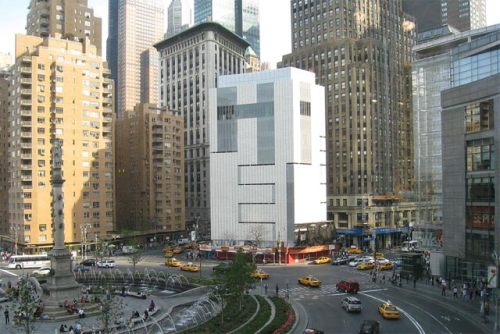
This pitiable building scores atrocity points on several fronts, but has one positive point in its favor: Atleast it covered up the shitshow that preceded it (below).
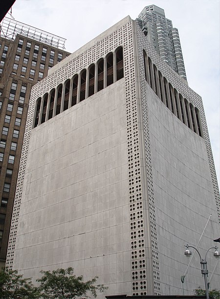
Originally built by noted architect Edward Durell Stone in 1964 for eccentric playboy millionaire, Huntington Hartford, for his "Gallery of Modern Art," a would-be competitor of the Museum of Modern Art (which Stone also designed). It's almost inconceivable that something so aesthetically putrid was brought forth by the same man who designed the beautiful lobby and ballroom of the Waldorf-Astoria, as well as important elements of Rockefeller Center--but it's true. The virtually windowless, faux-Venetian mess soon went belly-up and the building sat in disrepair and neglect for many years before finally getting an "extreme makeover" in 2008. There were high hopes that this small, but very visible segment of the newly glamourous Columbus Circle would be somehow revivified, and at the very least, would be a complement to the glitzy new Time-Warner Center next door. It didn't happen. The designers, applying the proverbial "lipstick on a pig," slapped some new smoky glass siding on it and called it "modern". There was a great hue and cry from preservationists (!) who fought hard to save Durell-Stone's original design. After seeing how the made-over building turned out, I'm convinced that tearing the whole thing right down to the ground would have been a much better solution.
(Above) The original building's most laughable design element, the "lollipop" pillars are still in place but mercifully shielded from view beneath the new curtain of glass.
#9: The AT&T Long Lines Building, 33 Thomas Street in Tribeca.
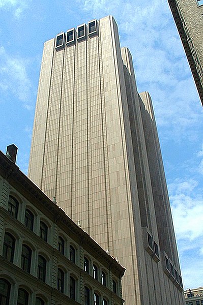
There's something extremely scary about this building. Granted, they were limited from a design standpoint, as it is one of the major "guts" buildings for AT&T in Manhattan (and beyond). It houses major wiring and equipment. But it is utterly GIGANTIC, and has virtually no windows whatsoever....basically, a huge granite, 70's-style (built in '74) bunker that can supposedly survive a nuclear attack. I don't doubt it. It just doesn't make for a very friendly neighbor, does it? That is, unless the bombs are falling and you need a convenient place to hide...

#8: 375 Pearl Street--"The Verizon Building".

Much like its scary behemoth sister, The AT&T Building, The Verizon Building appears completely windowless (though, apparently, it's not), as it was also built as a "guts" building for telephone equipment/wiring. Built in 1975 (what the hell was going ON in the 70's??), it has been universally loathed since the day it was built, probably more for its location than for the building itself: It appears to be barnacled on top of the beloved Brooklyn Bridge. It completely overwhelms its surroundings and provides no design element of any kind.

#7: Fifth Avenue Synagogue, 5 East 62nd Street.

On a block lined with eye-popping Beaux-Arts mansions from the robber baron era sits this alien invader from the planet Heinous.The sad little windows, which seem to have been sort of gouged out as an afterthought ("WE NEED AIR!! GIVE US SOME AIR IN HERE!!") are lined on the inside with typically awful 1960's stained glass. It's offensive from both a contextual, as well as a design (or lack of) standpoint. This one's got to go. Its design will never, ever be loved. (Woody Allen singled this awful building out for scorn in his film Hannah and Her Sisters).
#6: The Marriott Marquis Hotel, Times Square

Important reasons to hate this building:
a) In 1985, they tore down five historic Broadway theatres to clear the way for this poured concrete behemoth that has absolutely zero connection to its surroundings.
b) It has a revolving restaurant. Revolving restaurants do not belong here. Revolving restaurants belong in Niagara Falls. And I don't give a #!&*$@ if I get to keep the Marriott-shaped glass of my $19 cocktail.
c) It has become one of New York's most popular venues for committing suicide (jumping from the 45th floor through the central atrium).
d) It is ugly. Ugly, ugly, ugly.
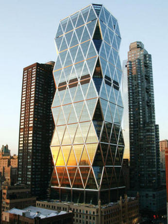
#5: The Hearst Tower, 300 West 57th Street.
If it looks as if this picture has been Photoshopped to merge two completely opposite and uncomplimentary-styled buildings into one, it's not. William Randolph Hearst commissioned the base of this building in 1928 as the first six floors of a huge skyscraper that would house Hearst, Inc. When the Depression came along the next year, those plans were scotched and for almost 80 years, the company made do with just the six floors. Along comes radical British architect, Norman Foster, with his crazed ziggurat design, which they simply plopped on top of the poor, creaking Deco bones beneath it. By any stretch of the imagination, it has no aesthetic congruity or even eccentric appeal. What's more, the top of the building is an even bigger failure. It's as if they ran out of money, once again, mid-plan. Nearly everyone agrees that it looks incomplete--as if it's missing...something. But, what the hell? It's good enough for Queen Oprah (that's where she has her New York offices). The view is probably pretty nice up there....since you don't have to look AT this mess once you're inside it.
#4: Madison Square Garden and Penn Station, 7th Avenue at 34th Street.
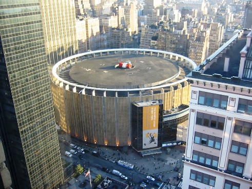
Unlike 2 Columbus Circle, which earns positive points for replacing something horrid, the current incarnation of Madison Square Garden and Penn Station deserves hatred for destroying perhaps New York's singlemost beautiful public space: The old Pennsylvania Station, which was razed to the ground to allow these architectural abortions to take root. Study the following photos of what was lost in the early 1960's to the greed of the Felt family, the driving force behind this project. May God forgive them---because New York never will:


In all their early 1960's wisdom, this (below) seemed to be a much better idea:

I'm fairly certain it never looked like this. But I am certain that today it looks just terrible. Dirty, tired, beat-up, dated. And why don't we see the replacement train station in the photo above? Because they somehow paid---I MEAN, "convinced" the right city officials to cram the station---the busiest train station in the world---completely underground! Entering New York City into the epic cathedral that was the old Penn Station was once a grand, enobling experience. Now, entering New York through the current warren of dark, filthy hallways is more like a rat crawling out of the ground.

After overseeing the bulldozing of this beloved, iconic building, Irving Mitchell Felt then even had the nerve to name one of the arenas of the new Madison Square Garden "The Felt Forum" (it's not called that anymore, fortunately). No doubt, these buildings' time is just about up, too. Removing them completely and starting over is clearly the best option, if only to erase the memory of New York's single-greatest architectural debacle (there has been talk for years of moving Penn Station into the grand Beaux-Arts Post Office Building across the street, though it will be utterly amazing if that ever happens in our lifetimes). The only good thing that happened from this mess was the creation of the Landmarks Preservation Commission, which is supposed to be the advocate for New York's deserving architectural treasures. It doesn't always work, but atleast it's something of a safeguard against such a crime against aesthetics ever occurring again.

#3: 3 Columbus Circle (see previous blog entry)
http://didyoujustseewhatisaw.blogspot.com/2011/01/trainwreck-how-not-to-redesign-building.html

(Photo: Courtesy of CurbedNY)
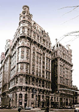
#2: 201 West 72nd Street--The Alexandria Apartments

One of New York's most embarassing failures. Built in 1991, in a style that they hoped would "echo" the architecture of its neighboring masterpiece, The Ansonia, it is more of a mockery of true design. It looked "dated" the day it was built, what with its awful teal accents and cheap, tacky flourishes. To complete their "nose-thumbing" at the Ansonia, adding major insult to grievous injury, the Alexandria also completely blocks the downtown views of all south-facing apartments of the Ansonia, forcing them to look at this abomination.


#1: The Whitney Museum of American Art, 975 Madison Avenue

There is absolutely nothing to love or admire about the Whitney. Completed in 1966, it could be compared to an upside down bunker--and a particularly ugly one, at that. It was designed by "noted" Hungarian architect, Marcel Breuer. Must have seemed like a good idea in 1963, but if there was ever a time when New Yorkers embraced this awful, soul-sucking mess of a building, the time is not now. The randomly-placed, oddly-sized windows--what, are they to show how clever he was? Adding to the embarassment is the fact that one is made to enter, basically, through the basement of the building. And thrown into the context of Manhattan's posh Upper East Side, it bears absolutely no relation to anything else within miles (except maybe that huge silo along the East River where they store salt for winter roads). Fortunately, the Whitney has broken ground on a brand new building, connected to the trendy High Line Park in the Meatpacking District. They haven't yet announced what's to become of this monstrosity. No doubt, if there were rumblings of getting rid of it, the "preservationists" would be out for blood, screaming that this joke of a building needs to be saved. No, in fact, it doesn't. It's been hideous since the day it was built and in these more enlightened times, it looks even worse. TEAR IT DOWN!

site needs work, a lot of images are missing
ReplyDeletejordan shoes
ReplyDeletenike air max 97
supreme new york
vapormax
goyard handbags
lebron 13
goyard bags
jordan shoes
hermes birkin
coach outlet
kd shoes
ReplyDeletekd 12
golden gooses
golden goose outlet
calvin klein outlet
adidas superstar
christian louboutin shoes
nike air max
yeezy shoes
kobe sneakers